NASA says 'Ocean is changing', shares visuals showing impact of greenhouse gases
As there is a massive increase in greenhouse gases such as carbon dioxide, the Earth's temperature is rising which in turn is increasing the temperature of Earth's water bodies threatening ecosystems.
EPN Desk26 June 2024 06:58
The National Aeronautics and Space Administration (NASA) has recently shared a visualization of the oceans showing the impact of greenhouse gases and climate change that's changing the Earth's water bodies.
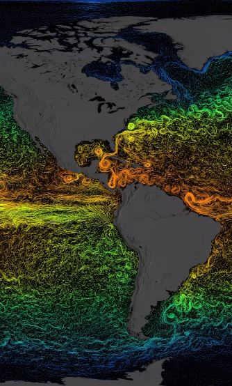
The visualization of the Circulation and Climate of the Ocean, Phase II (ECCO2) model was shared on the official Instagram account @nasaclimatechange.
The pictorial representation shows colors such as warm red, orange, and yellow depicting the average temperature of the ocean, while cooler regions are represented by green and blue.
As there is a massive increase in greenhouse gases such as carbon dioxide, the Earth's temperature is rising which in turn is increasing the temperature of Earth's water bodies.
According to research, around 90 % of the heat of Earth is absorbed by the ocean and the greenhouse gases are impacting Earth's water bodies. "Our ocean is changing," the caption of the post read.
A visualization showing sea surface currents based on the Estimating the Circulation and Climate of the Ocean, Phase II (ECCO2) model. The colors show an average temperature for the current, with warmer colors (red, orange, and yellow) representing warmer temperatures and cooler colors (green and blue) representing cooler temperatures.
"With 70% of the planet covered by water, the seas are important drivers of Earth's global climate. Yet, increasing greenhouse gases from human activities are altering the ocean before our eyes. NASA and its partners are on a mission to find out more," said NASA.
Further, elaborating on the visualization, NASA shared that the different colors depict the average temperature for the sea surface currents.
"With warmer colors (red, orange, and yellow) representing warmer temperatures and cooler colors (green and blue) representing cooler temperatures," the agency added.
"The visualization shows sea surface current flows. The flows are colored by corresponding sea surface temperature data. The time range for this particular visualization is from 2007-2008," NASA explained while responding to a comment.
This visualization showing the effects of climate change on the ocean raises concerns about human activities threatening marine ecosystems, which in turn affects human life.


.jpg&w=3840&q=75)


.jpg&w=256&q=75)
.jpg&w=256&q=75)
